Moments Mood Tracker App Redesign
For this project, I redesigned a mood tracker app. For this app, I did research into competitors and found what would work best in this redesign. I created personas, wireframes, and information architectures. I also conducted visual research for inspiration for color palettes, typography, and composition for the redesign. From there, I created compositions for the new design. I finally created a prototype of the new app.
Tools Used: Adobe Illustrator, Adobe InDesign, Figma, Zoom
The Process
I started this project by conducting research into the app I was redesigning and the app’s competitors. By doing this I gave myself an idea of what areas of the app needed work and what content and functionality should be included in the redesign.
I then conducted user interviews to get a better idea from the users directly about how they would use and interact with the app.
I then created a persona to represent the users that will be using the app. This helps to keep the user in mind while redesigning the app. I also created an empathy map for the persona to further the understanding of the user.
I then created an information architecture to act as a map for the layout of the content and what content will be included. I first created a sketch of the information architecture, and then I created a digital information architecture.
I then created wireframes for the screens of the app to lay out how the content will look. This helps to give a better idea of how the app will look and function without having to worry about the actual content or design elements.
I then conducted visual research to get an idea of how I wanted the design of the app to look. From this visual research, I conducted color and type studies to figure out what colors and fonts I wanted to use for the app.
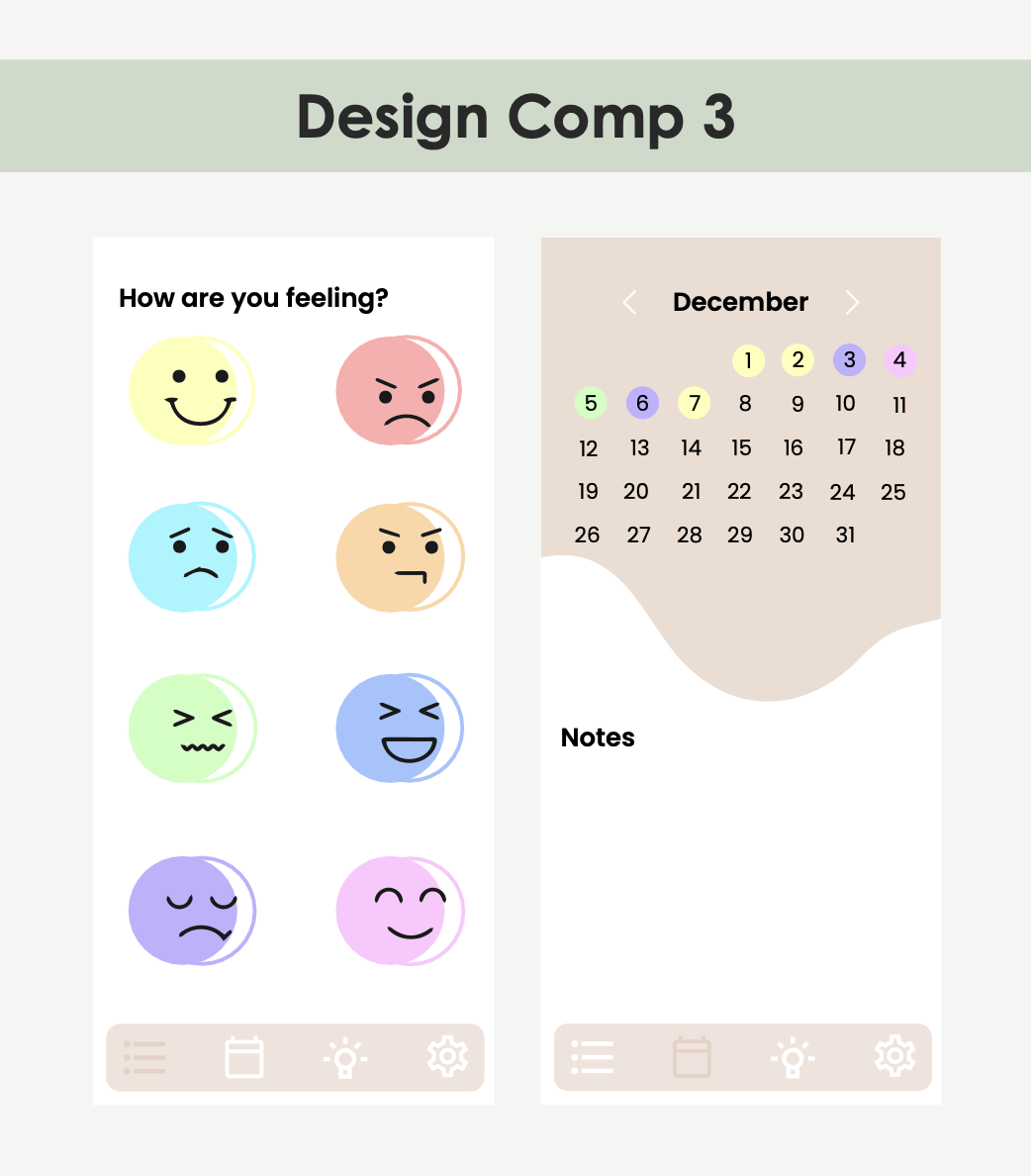
I then created three different design comps based on my wireframes. I used the color and type studies I conducted to create these comps.
From the design comps I created, I chose the design that looked and functioned the best. I then created a high-fidelity prototype based on my wireframes, information architecture, and design comps.


