hangr: Clothing Rental App
For this project, I created a clothing rental app. The purpose of this app is an online clothing rental store where you can rent clothing for all occasions. To create this app I created a project proposal, project plan, user research, personas, empathy maps, competitive analysis, visual research, wireframes, information architecture, color studies, type studies, created graphic design/UI elements, and a prototype.
Tools Used: Adobe Illustrator, Adobe InDesign, Figma
The Process
I started this project by creating a project proposal. Within the project proposal, I included a problem summary, problem solution, project scope, and timeline for this proposal.
I then created a full project plan using Trello to lay out all of the work that I would need to complete for the project.
I then conducted user research where I interviewed three different users. Within these interviews, I was able to gather background information from the users, as well as any important information that will help in the development of the app.
From the user research I completed, I created three different personas that represent the different users of the app.
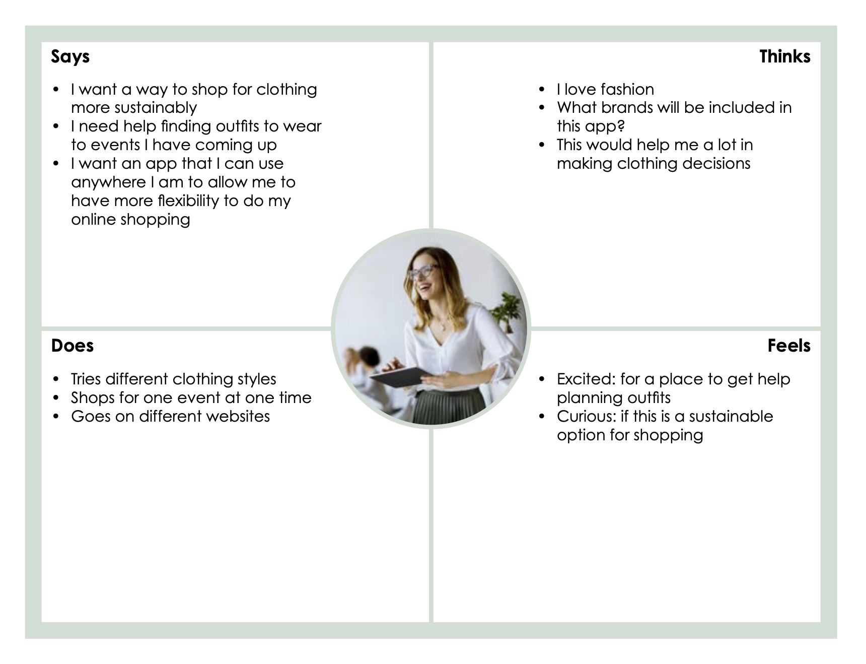
From the user research and personas I completed, I created empathy maps for each of the personas.
I then conducted competitor research where I looked into already existing clothing rental apps. I looked at how these apps function, what features they offer, and how consumers are enjoying them. I also included images of what the apps look like. Also within this competitor research, I conducted visual research into what I want my app to look like and how I want it to function.
The next step was to create the wireframes for the app. The wireframes are a way for me to gain a basic understanding of how the app will actually look, at a very basic level.
I then created the information architecture for the app. The information architecture is a way to help me gain a better idea of the app’s functionality, as well as where all of the content will be placed throughout the app.
I then conducted color studies, and type studies, and I gathered any of the images that I was going to use throughout the app.
The final step was to create a prototype for the app. To do this, I followed along with the information architecture and wireframes to create the screens for the app. I also utilized the graphic design and UI elements that I have already gathered and decided upon.


